Trellis Design Tokens
Creating a new design token system that supports the HubSpot's classic visual language (Canvas) and prepares the product for its emerging future visual language (Trellis)
These 2025 Figma variables showcase how the design token system I began building in mid-2023 has evolved.
Base level need for a refined set of design tokens
Shortly after joining HubSpot in the fall of 2019, I identified an opportunity to better embrace design tokens within the system.
The React component library of 300-plus components was leveraging an existing systems of variables. As I inspected the system, I realized the variables system consisted of two layers, consisting of:
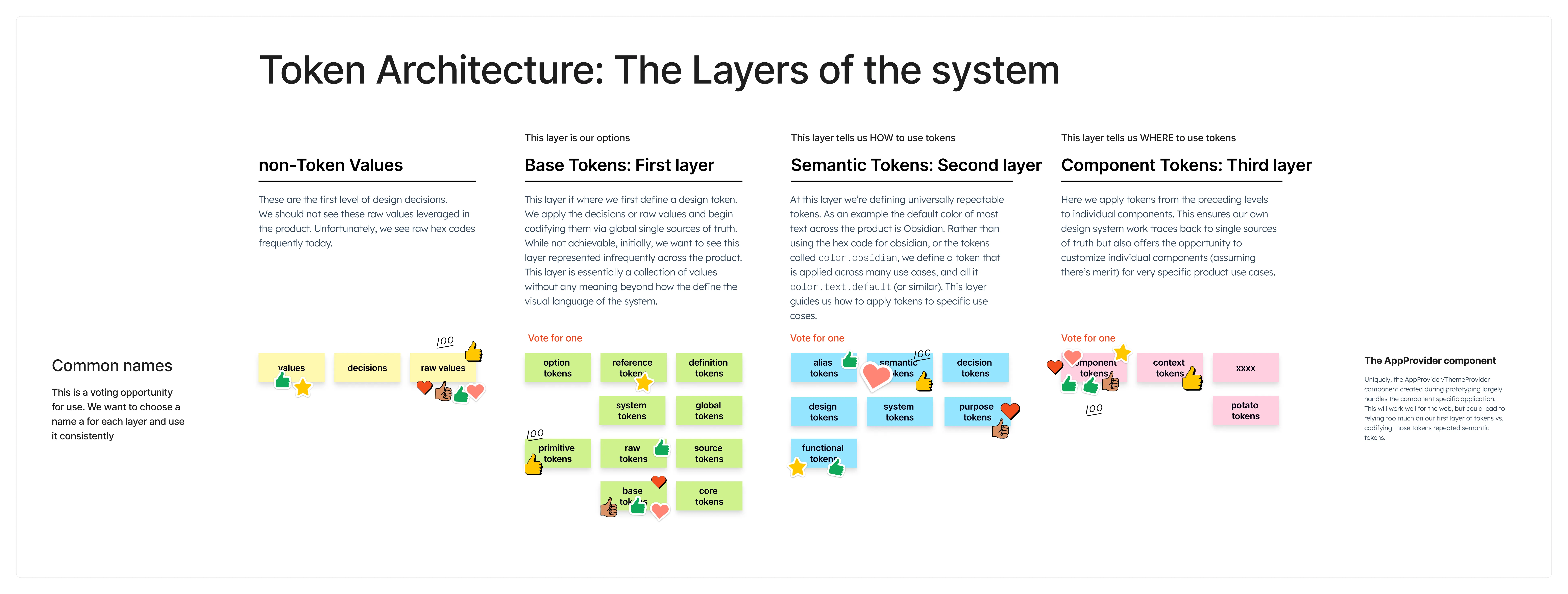
- An un-opinonated base layer. These variables described the visual language of the design system but lacked meaning. This is how the majority of components were styled.
- A very contextually precice set of component tokens that provided sparse coverage across the component library’s needs.
Given the sparse coverage of componenet-specific tokens, the base layer was widely applied within the component library.
The system and its consumers would likely benefit from better semantic distinction.
I assumed selling the idea of improving the token system would be a slam dunk.
Unfortunately, in 2019, the appetite to invest in an improved token system was low. One engineer casually told me that “Design tokens are just implementation details.” This sent a clear signal just where we were on our design system journey. I knew this would take some time, and I’d need to wait for the right strategic moment.
I outlined a proposal, hit save and waited for the right moment.
I continued evangelizing design tokens when I could strategically work it into tactical conversations.
Primarily, I waited for a moment of opportunity.
The great type migration of 2022
In 2022, the product changed typefaces, switching from Avenir Next to Lexend Deca.
In a “perfect” system, a migration like this would require updating a few lines of code, uploading new font files to the CDN, performing lots of testing and making visual adjustsment for fit and finish. Easy, right?
In reality the migration took longer than expected and required 100s of hours of auditing, communicating with teams and identifying places where teams had opted out of the system’s source of truth. Universal changes are often challenging. Within an organization that prides itself on small autonomous teams, changes like this are grueling. Despite this, the migration was successful.
The migration exposed the cracks within the system. Our team began asking whether we were as resilient and scalable as we should be as a “design system.” I finally I had a compelling narrative hook to sell design tokens to leadership.
Over the next couple weeks, I collaborated with an engineering partner to craft an updated proposal for design tokens.
Kicking off. Auditing. Learning.
The engineering partner I’d collaborated with on the proposal departed on family leave shortly after we received the thumbs up from our leadership. This left me as the primary IC focused on the creation of the token system during the early stages of the project.
Thankfully, another engineer stepped in to help with the early audits of our component library. They wrote a script to find all the style values that were applied to components. The script pulled SASS declartions as well as nuanced Styled Component conditionals, leaving us with a big pile of values. I combed through the values and began contextualizing and organizing those values into categorized buckets.
One unique challenge with the design system, is that there are a number of sneaky design decisions that didn’t “offically” exist in our visual language or the existing token system. These bespoke visual atoms included aspects like type specs of a button, the hover state of a link or some unique disabled text colors that deviated from all other disabled text colors. As painful it was to document those examples might have been, I was super excited to be establishing a method of erradicating them in the future.
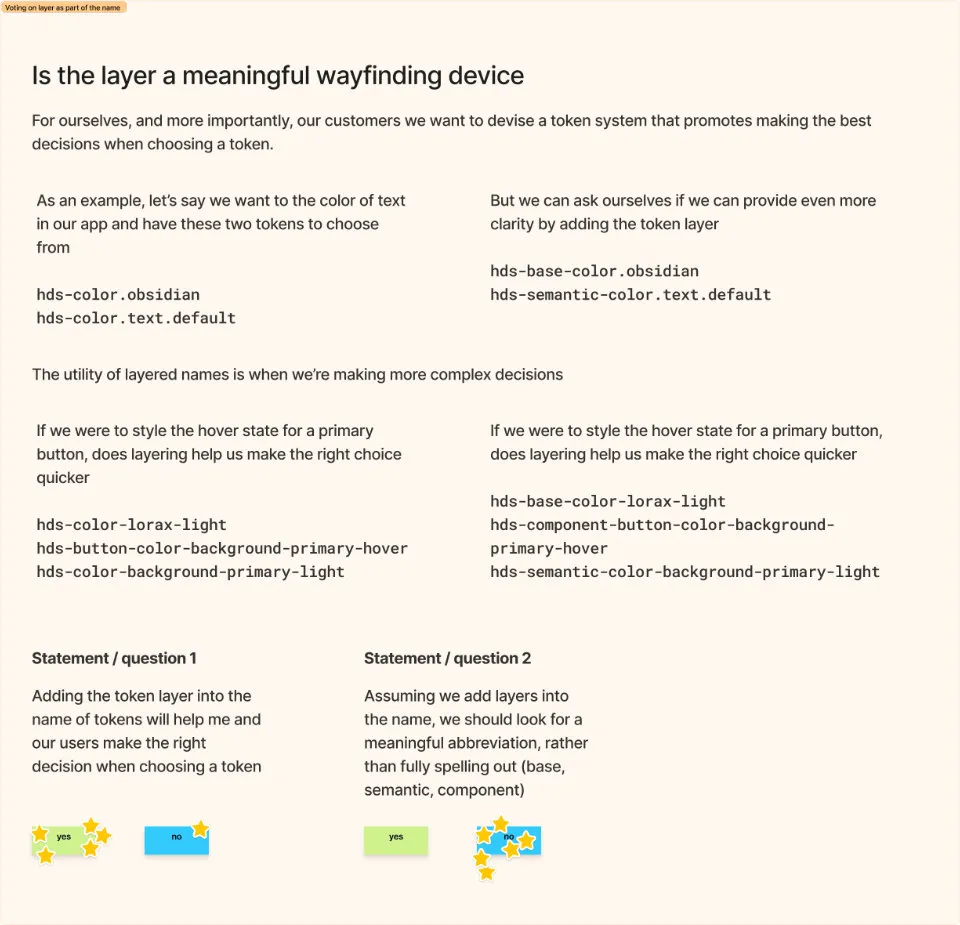
To prevent from subjecting the team to a weekly Ted Talk, I tried to make the weekly Jams interactive, giving team members a voice in the decisions being made, whether it was the name of token layers, or overall taxonomy approaches.
Learning. Sharing process and progress
In addition to audits, I wanted to level up my own token knowledge. The thinking related to design tokens had evolve since I was on the Uniform team at Hudl so I wanted to refresh my and level up my knowledge.
As part of my own learning I wanted to bring the team along on the journey and find ways to include them not only with updates but also opportunities to invovle them without pulling them away from their assigned project.
Each week, both functions of our team meet for a Design and Engineering Jam.
Over the course of a few weeks I took 15–30 minutes of our Jam sharing one specific consideration related to design tokens. To prevent turning these sessions into a weekly Ted Talk I strived to make them interactive through open feedback exercises, voting opportunities and always soliciting any additional support were willing and able to offer.
Create a Taxonomy and naming convention
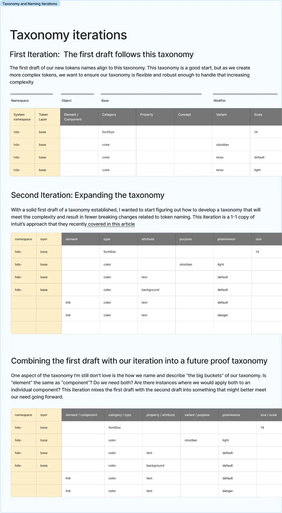
In addition to finishing up the initial rounds of audits, I began iterating on establishing a taxonomy and naming convention for the new token system.
The evolving naming convention was inspired by my previous work on the Uniform Design System at Hudl, articles by Nathan Curtis and Nate Baldwin and other design system examples, including Polaris, REI Cedar, Atlassian and Material Design. I weighed the needs those systems solve for, compared to our own needs.
After some quick rounds of iteration and stress testing the naming convention, I shared my progress with the team to solicit feedback.
The initial naming convention came together over the course of a two-week sprint. As I iterated I created proof of conception tokens, that I was then ran through a local instance of Style dictionary on my computer.
In addition to sharing the progress live in our weekly Design and Engineering Jam, I made loom walking through my process and seeking feedback.
Continuing to rely on the team for feedback and decisions
Let’s be honest, asking team members to vote in a FigJam file isn’t a replacement for deep collaboration.
I’m definitely not suggesting this was perfect.
But, with everyone else allocated to other design system initiatives, this was one of the best ways I could bring everyone else along.
Design Token Naming Worksheet
Once the naming convention felt solid, I created a Fig Jam template that would allow anyone to create a new file and begin creating their own tokens, as needed.
At this point, I was to sole token creating, but I assumed eventually the entire team would be contributing to growing the system so I wanted to establish a resource from the begining that would help us keep the token system cohesive as it scaled.
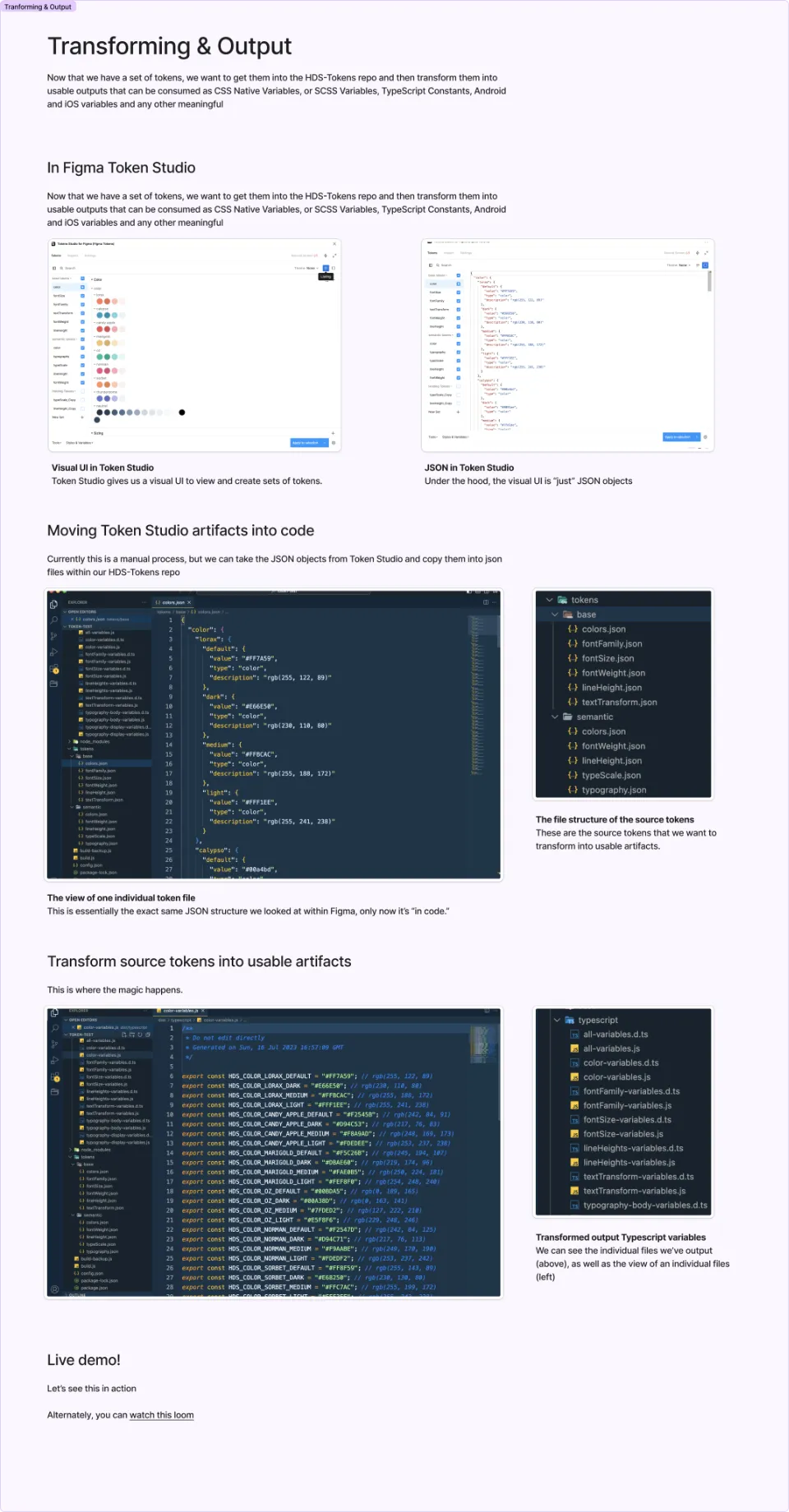
The token tooling stack
The creation source of truth for the token system was Token Studio file in Figma. I generally like to think of code as the source of truth for design system decisions. So this was a slight deviation, but with a purpose.
When this project started, Figma hadn’t yet announced it’s long rumored Figma Variables feature. Token Studio would give us a meaningful way to apply style to Figma Components as proof of concepts.
Token Studio gave me a quick, handy visual UI, empowering me to quickly iterate on tokens and create JSON that could be pasted into code and pushed to github and PRed. I’ve written plenty of JSON by hand. I’ve also spent plenty of time hunting for a missing closing curly brace or missing comma. The Token Studio plugin was a powerful tool.
This was a manual process. I would manually copy the JSON from Token Studio into VS Code and push the changes, rather than automatically syncing Token Studio with HubSpot enterprise version of Github.
Again. I shared my process and progress with the team each week, and created Looms for async sharing and review.
Early progress and initial success
After a successful quarter-plus of work, we had a solid first iteration of a new token system:
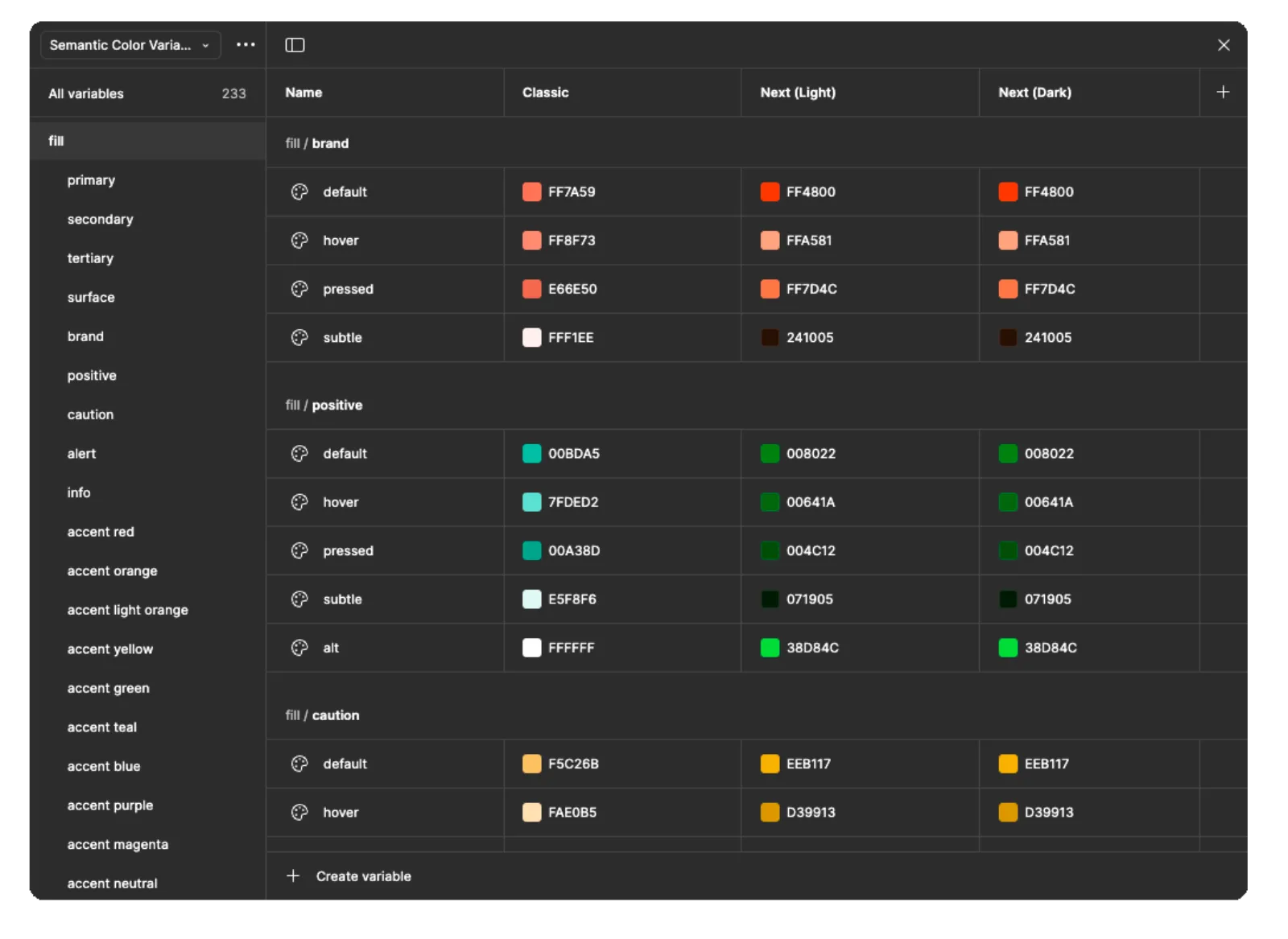
- A Base Token layer of about 125 tokens, describing all the unopionated options for color, typography, spacing and shape. This was easy to create, as it describes all the visual design decisions of the system today.
- A Semantic Tokens layer of about 300 tokens. The semantic layer was actually a mixture of truly semantic tokens like
color-text-defaultand more contextually precise component tokens, likebutton-color-bg-primary.
We had agreed that some level of contextual precision would be needed, we just exactly sure how far down this rabbit hole we needed or wanted to go. The old rumor of Adobe Spectrum having 1000s of component tokens was the campfire story we’d tell while debating the right level of precision.
The new token system was also powering new <Text />, <Spacer /> and <View /> foundational components the engineers had built. Additionally, we had the toke infrastructure to support Buttons, Links, Inputs, FormControls and Radio and Checkboxes, as well as Tile, Card and Modal components.
The new foundation components were being tested with Early Adopters and in some cases already shipping to Prod.
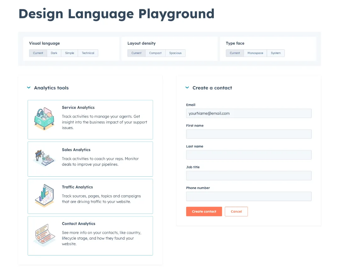
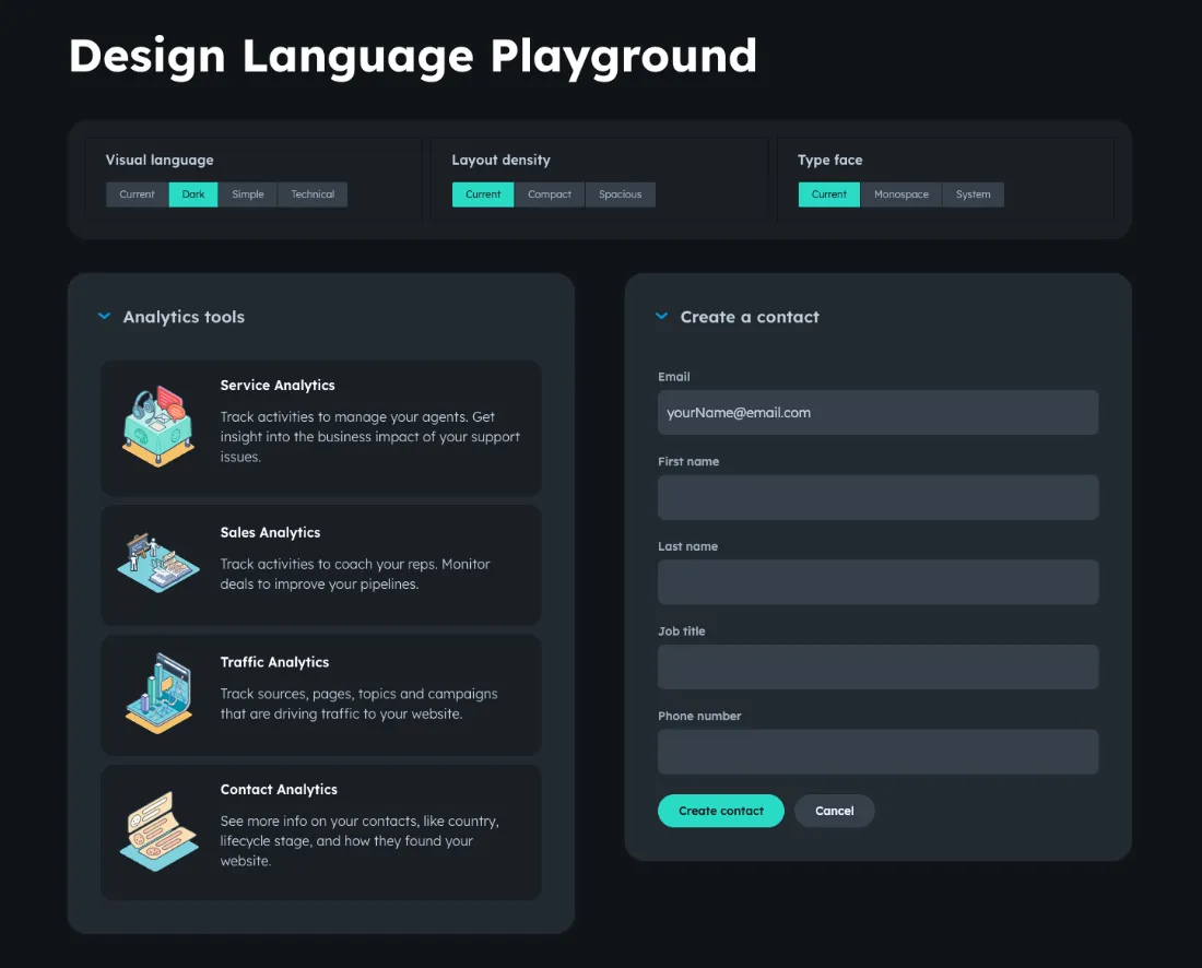
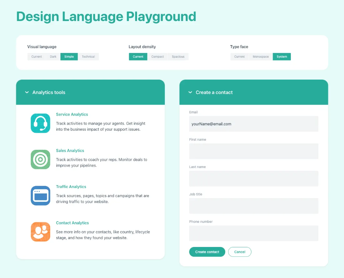
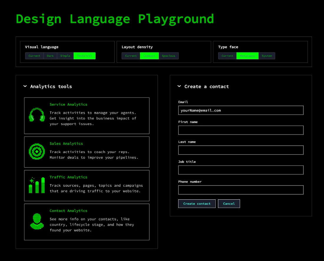
Showing the value of Tokens with a Playground site
In Q3 of 2023, the C-Suite asked for an example site to serve as a “roadshow” for an upcoming leadership event.
With my original engineering partner back from family leave, we build the Design Language Playground over the course of about a sprint and a half.
While the development work was handled by myself and my engineer, the design of the individual concepts was a team effort between myself, two other designers and even our design director.
The layground showcases four primary design language levers:
- Classic: HubSpot current visual language.
- Dark: A hypothetical example of a HubSpot with a dark mode.
- Simple: An alterate take on HubSpot’s visual language.
- Technical: Reimagining HubSpot in the developer-centric terminal-like interface.
Each lever altered the color palette, typography, shape language and illustrations.
Additionally, a user could further refine a selected theme with granular dials, controlling layout density and type face.
It highlighted various directions and opportunities we could offer for increased user control with a design token driven product.
Making revisions, organizational changes and handing off the project
In Q4 of 2023 a number of significant changes occurred.
- Though we had settled on re-naming the design system from Canvas to HDS (HubSpot Design System), the tides had turned amongst leadership. We decided to rebrand the design system as Trellis, rather than HDS.
- HubSpot hired an external design agency to begin creating a refined and evolved brand identity, that would re-align Brand with Product and add the concept of dark mode and theming into the mix.
- Our Design system engineering team decided to pivot their React component modernization strategy they’d been following through the second half of 2023.
And in early 2024 I was going to need to rotate away as the primary owner of the token system and onto some high value Storybook/documentation-related work.
Stay tuned for the phase 2 of the token system.