Trellis Design System Launchpad
As HubSpot’s design system evolves from it’s humble beginnings (Canvas) to a multi-themed, modernized system (Trellis), design system documentation needed to evolve with it
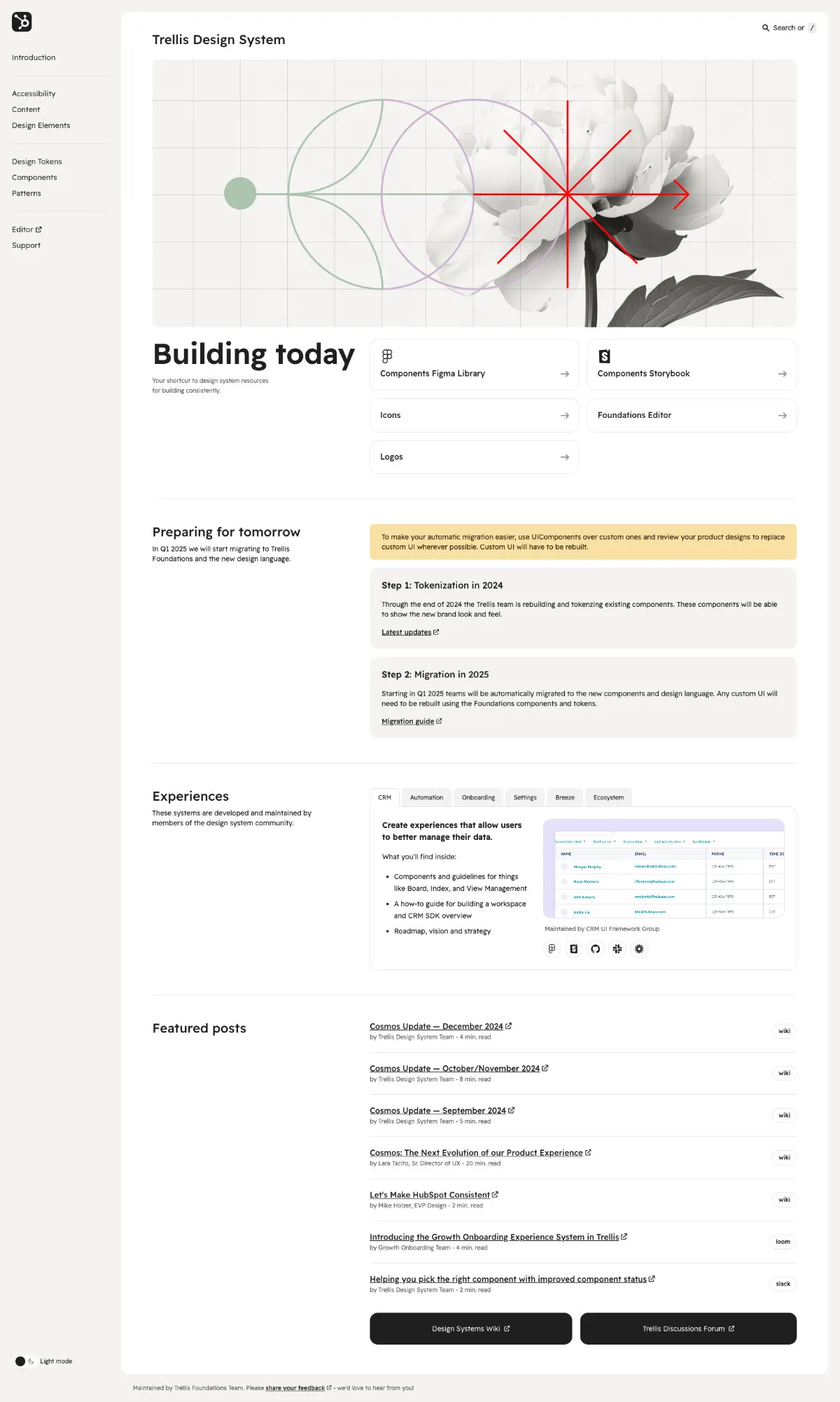
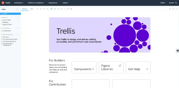
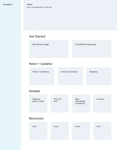
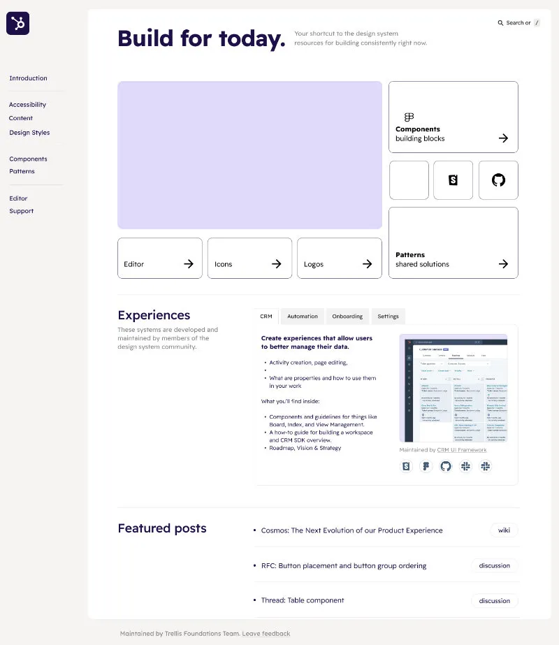
⬍ Scrollable: Trellis Launchpad Homepage
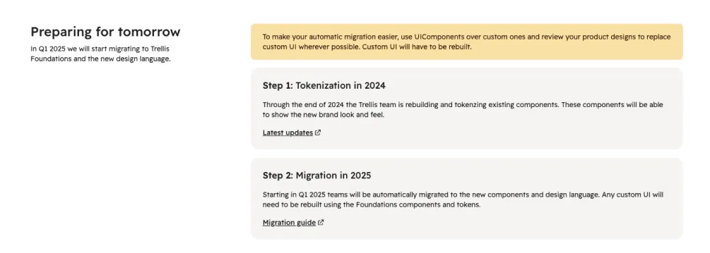
Countdown to Trellis
Design Systems at HubSpot are at an inflection point in 2025. Over the next year, the product will evolve from its legacy design system, Canvas, to a new, future-focused design system known as Trellis.
The year of change will culminate with a new visual language, new Figma and React component libraries, a new mandate for product-level consistency and an eventual redesign of the product.
We needed to create a documentation site that could communicate status, facilitate discovery and help design system consumers apply the system.
In Q3 of 2024, a three-person team, consisting of myself as a Designer and Design Technologist, a Principal Designer and another Design Technologist kicked off a quest to launch a site that could match the aspirations of the Trellis design system.
We moved quickly and confidently during Q3 and into Q4, launching a new site that provides a more stable foundation for the documentation that exists today, as well as what will be created over the course of this design system evolution.
Short history of design system documentation
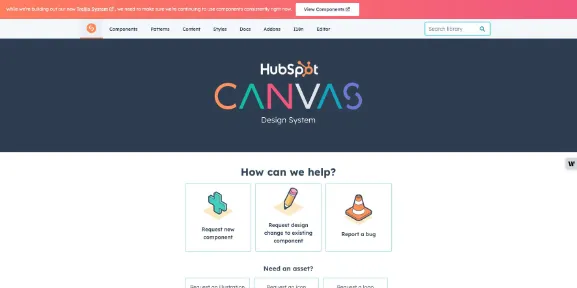
HubSpot’s Canvas design system launched in 2015. The system was documented via a bespoke, homemade solution, known as UI Library.
UI Library offered many table stakes attributes of a design system documentation site: editable code snippets, deep linking to individual specification, quick, visual search and most of all an IA that facilitates discovery.
As great as UI Library was for design system consumers, it had one major flaw. The tool was too tightly coupled with the one component library associated with the design system. For years, product teams requested use of UI Library to document their own group-level component libraries and subsystems. Unfortunately, this wasn’t feasible.
Enter Storybook. Storybook aimed to fill this gap for product teams. The Storybook aspirations quickly expanded to include all documentation, including the design system itself.
As good as Storybook is with component documentation, it can be challenging to create nuanced, long form design-centric documentation.
This left us at a crossroads, we had a legacy UI Library site as well as a Storybook site. UI Library’s usage remained too high to fully deprecate and remove, and complaints about the usability of Storybook were a going concern.
Our three-person documentation tiger team aspired to improve upon the documentation paradigm.
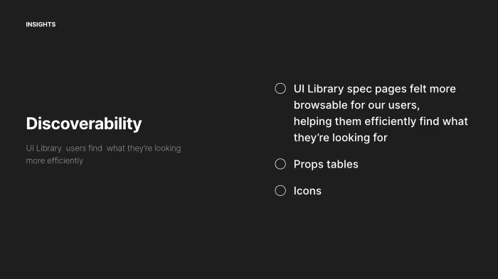
Engineers found UI Library more browsable, whether they were reviwing API documentation, searching for Icons or simply reviewing what a component can accomplish.
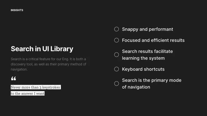
Search is the primary mode of navigation for engineers. UI Library's search was fast, focused and visual.
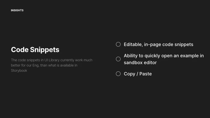
The editable, in-page code snippets of UI Library helped engineers quickly mock up ideas and experiment with a component.
The listening tour
Any good solution starts with hearing from the community to understand what would make their lives better.
We kicked off the project, with short conversations with designers and engineers. While we were already well-aware of the challenges designers were facing interacting with and discovering resources and guidance within Storybook, the engineering perspective was eye-opening.
We originally assumed that engineers all in on Storybook. However, our conversations uncovered a much different paradigm. While engineers tried to use Storybook, many found it too slow and “too fussy” for their needs. In many cases they ultimately abandoned Storybook for the faster and more easy to use UI Library.
Quick, tight design iterations and considering the tech stack
The site design quickly evolved from gray box content wireframes to rough designs to working prototypes. All three of us iterated on designs, refining and volley ideas back and forth.
On the technical side, me and the other design technologist on the team explore a few options for building the site. I explored an Astro-based approach, while the other DT tested a Next JS approach. In the end we ultimately decided to opt the product team’s existing front-end tooling. The platform team’s tooling is design to build the HubSpot, but by staying within the existing tooling, we would receive more support than if we had opted for a tool like Astro or Next JS.
Design ideas continued to evolve while the other design technologist and myself built the site.
The Roadmap section helps consumer see where we are and where we're going
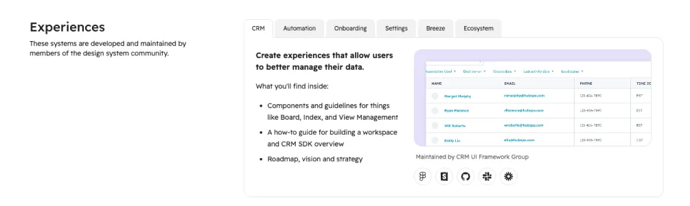
HubSpot has a number of product owned experience systems, the Experiences sections helps connect consumers to specific systems
Finding relevant information inside an organizaion is challenging
Connecting consumers to resources and information
In my experience, large enterprise organizations have an information problem. There’s no shortage of information. Rather, there’s too much of it … or more likely, information that is published across multiple platforms. This leads to information that is either lost to the ether (think Slack) or never found (think your orgnaization’s wiki). The Trellis Design Docs aims to connect design system users to information and resources.
We had a few primary types of information and resources we wanted to surface on the homepage to help consumers throughout the evolution:
- High-level roadmap. The design system will ask alot of of teams throughout 2025. The homepage, communicates the high-level plan to help teams understand and plan for what’s happening today, and what’s coming tomorrow.
- Connections to product-area subsystems. HubSpot has a few systems that are owned and maintained by specific product ground. If a designer is creating an onboarding experience, they need to be aware of the Onboarding Experience System from our Growth team.
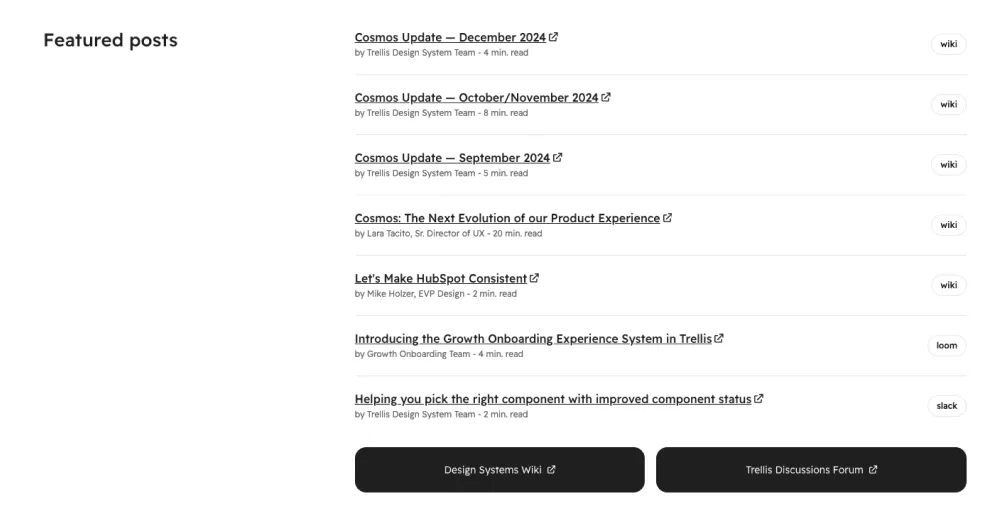
- Links to articles and presentations. It’s easy to miss information. This section of the homepage surfaces the design system’s monthly update, wiki posts from the VP of Design, as well as recorded presentations that are relevant to the design system and the Trellis evolution.
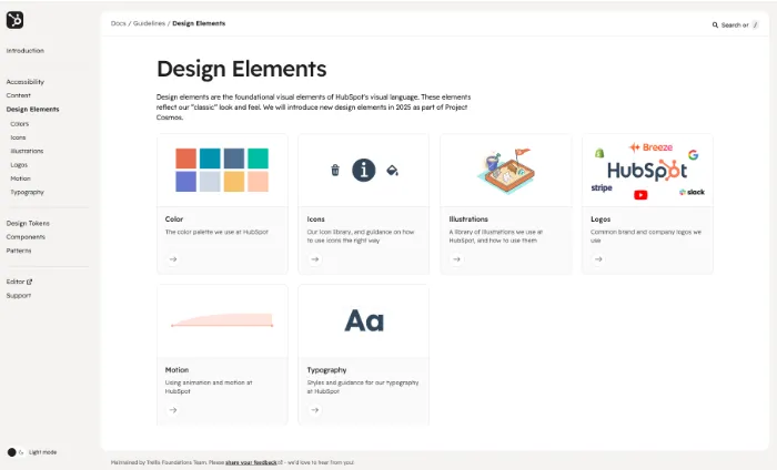
More prominent home for visual language documentation
Moving documentation to Storybook had an unintended side effect: essential design language guidance and documentation got lost in the depths of Storybook’s native IA.
Designers, especially those new to HubSpot, struggled to discover visual language guidance.
The new Trellis Docs restores the visual language back to the top level of navigation and creates visually distinct landing pages to help consumers more easily browse and discover the building blocks of the design system’s visual language.
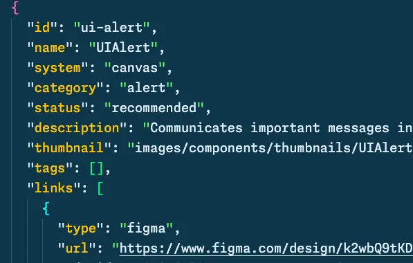
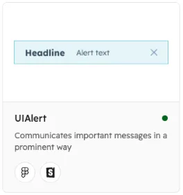
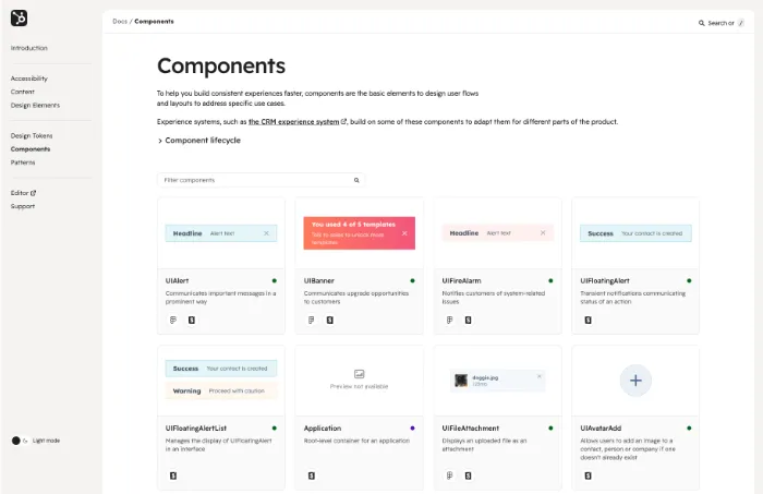
Many pages, like the Components Page are dynamically built with JSON APIs. While this creates the upfront work of creating a JSON object, the possibilities are endless in terms of where this information could be surfaces in the future.
Planning for future tooling
As we built the Trellis Documentation Site, our decisions were viewed through the lens of future needs. Pages like our components page rely on a JSON API to dynamically build the page. While not a groundbreaking concept. Creating this documentation API vastly improve upon the current Storybook paradigm where component status needs to updated manually across multiple Github repositories. As someone who has done more than his fair share of component status updates. Having an API-driven approach is cool. Eventually, we hope this API can power the information within Storybook.
Additionally, our team of three discussed ways we could leverage these APIs to create useful Figma plugins for designbers, or VSCode extensions for engineers to meet them where they work. Eventually, this site could be irrelevant if they information is available across the surfaces that disciplines touch.
Leveraging Trellis Design Tokens
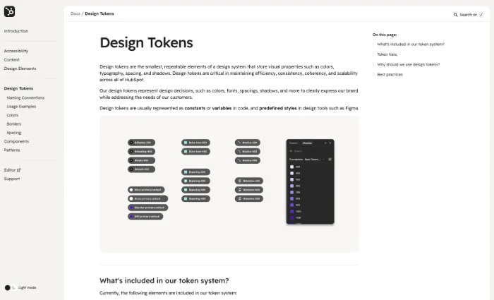
The new Trellis Design Docs are an early adopter of the new and evolving Trellis Design Token System. The site hints at visual language changes to come and unlocks the ability to have dark mode.
Outcome
Trellis Design Docs launched mid-Q4 of 2024. The analytics already show growing traffic and we’ve heard lots of anecdotal appreciation for out efforts. The Design Token documentation has already proved extremely useful for designers beginning to plan out how to migrate existing features onto the new token system.
There’s a long way to go, but this new documentation site should be the launchpad for all design system consumers.
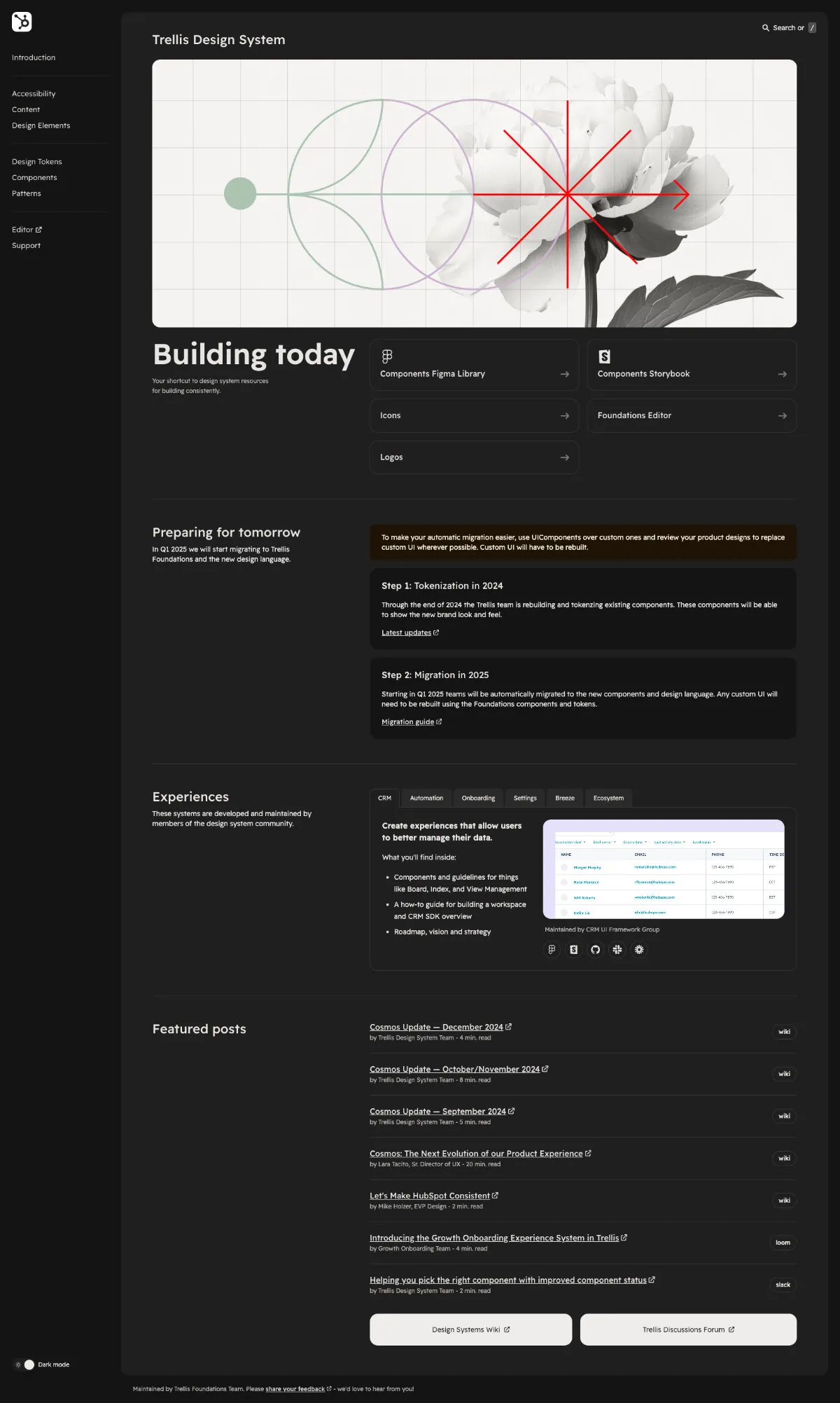
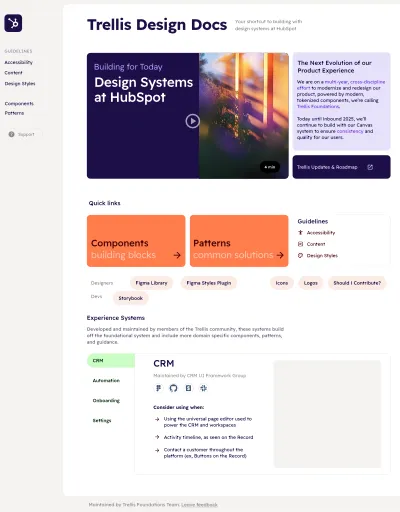
⬍ Scrollable: Trellis Launchpad Homepage